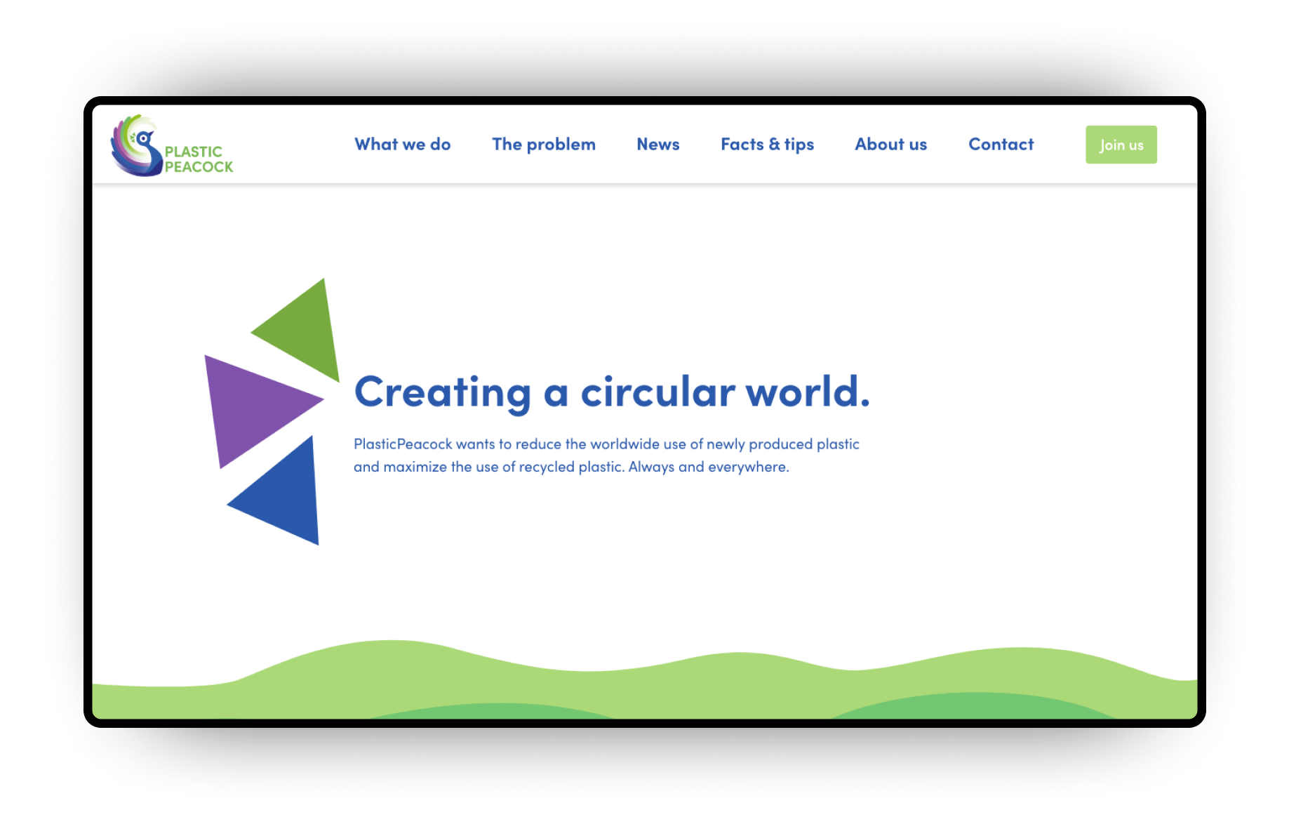
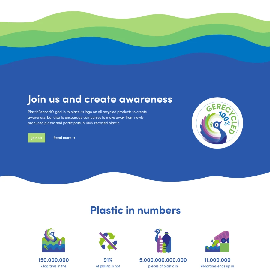
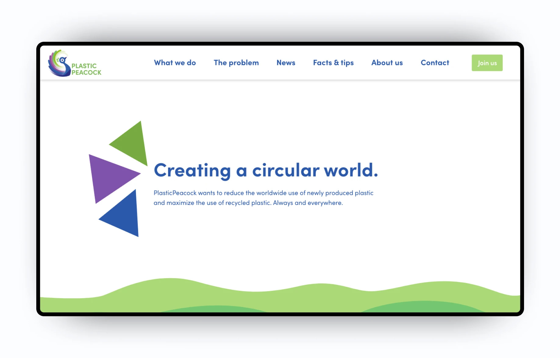
Plastic Peacock is an organisation with the goal to reduce the worldwide use of newly produced plastic and maximize the use of recycled plastic. It’s founded by one of my closest friends, whose mission it is to create a cleaner and sustainable planet.
My friends explained to me the idea that he had to fulfill his mission: A quality mark for all plastic products, showing how much of the plastic was recycled. To encourage companies to more recycling, and to create awareness for the people buying the products.
He was already in touch with a big plastic recycling company who was willing to back him up. He now needed help with introducing the company, and creating a website to reach his audience.
Problem and solution
Starting with just a logo
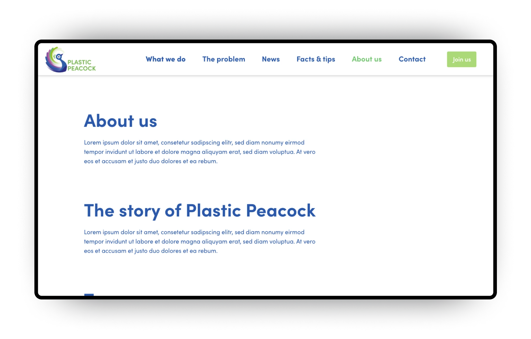
The logo of Plastic Peacock was already designed by the plastic recycling company, but they had never used it. It was a good start, but it meant that we had nothing more to go on, then an already created logo and an idea.
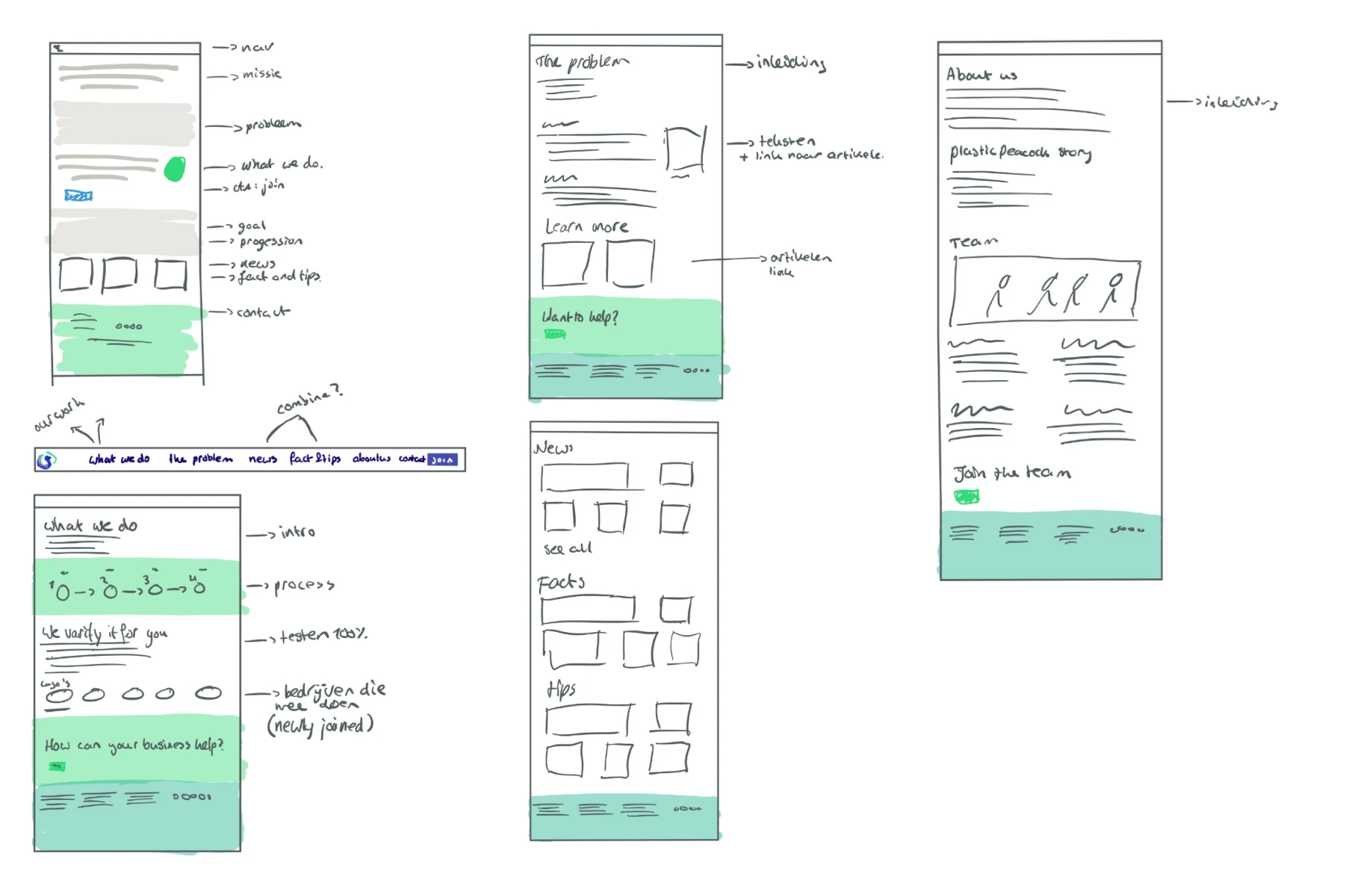
We discussed the mission and vision of the company and wrote the business concept on how to get companies to join. Then we started to sketch the website, what it should contain and what it should do.
Explaining the problem, creating the solution
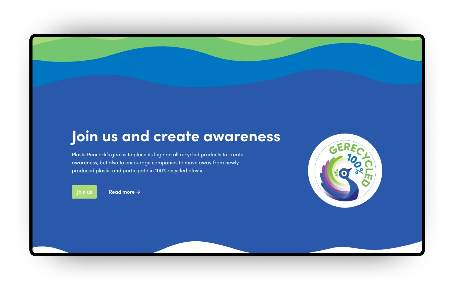
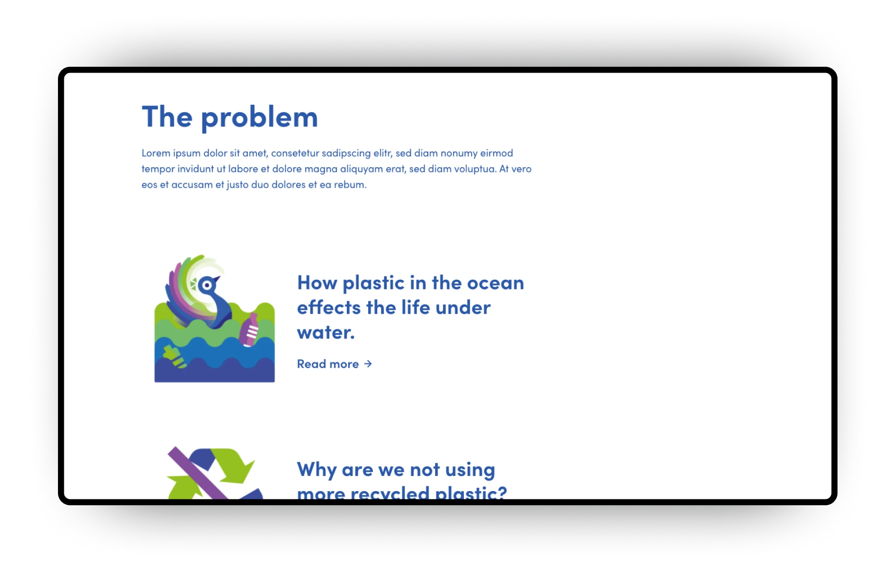
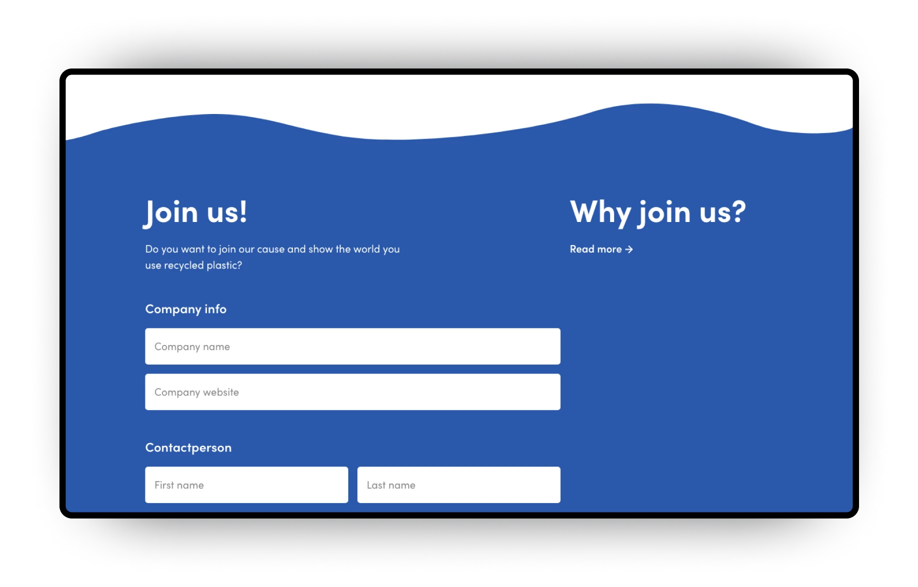
The website explains the problem: not enough plastic is recycled. That’s what Plastic Peacock wants to change. Companies can join Plastic Peacock, showing that they care about the environment, and that they also want to make a change. They will be allowed to use the quality mark of Plastic Peacock, creating awareness to their customers.
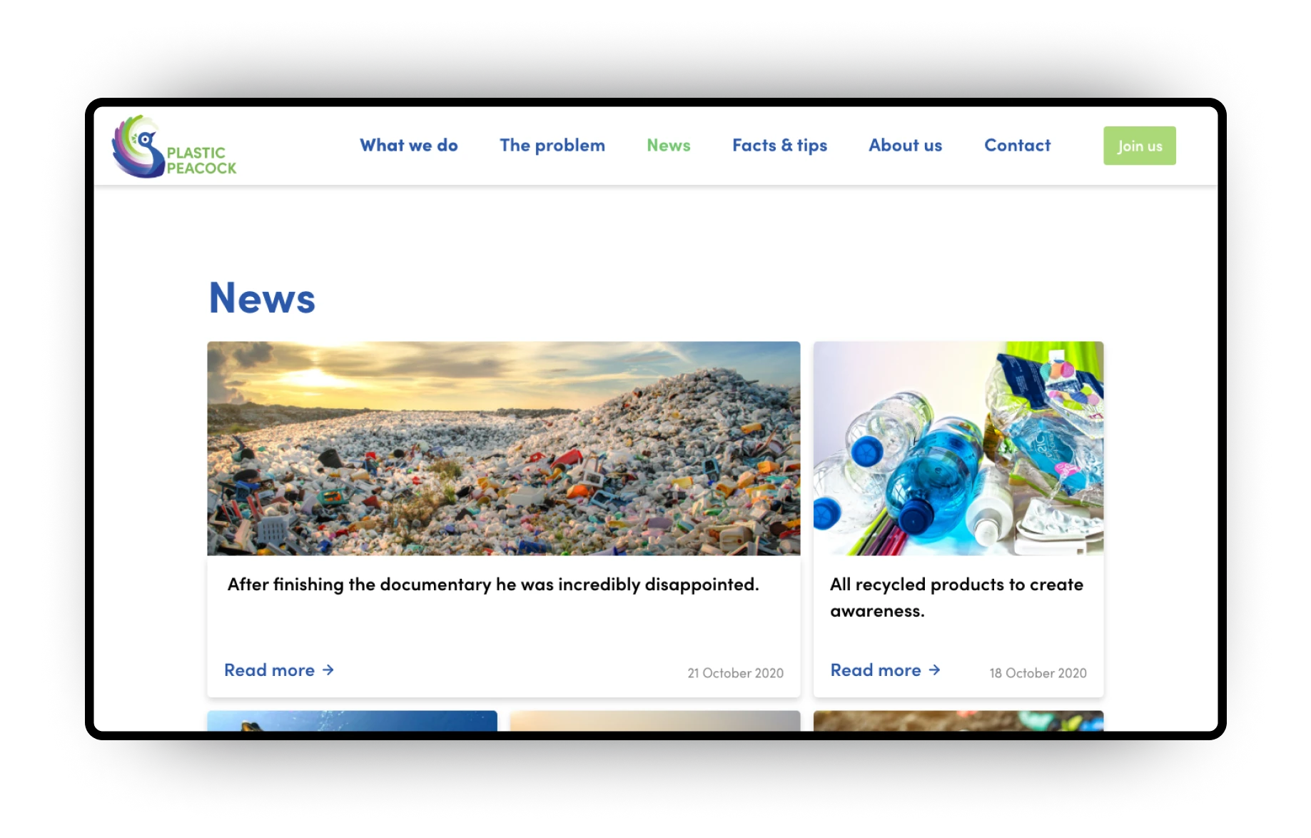
Furthermore, the website is used to tell the progression and changes that Plastic Peacock have made. It informs visitors about the ongoing battle against plastic.
Design system
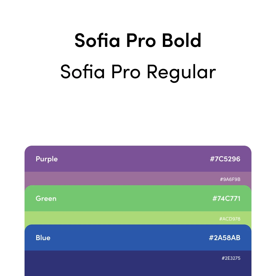
The logo was the main inspiration for the design system used for the website. The color blue is a hint to the ocean, which is affected immensely by plastic waste. It’s also the primary color used on the website, with purple and green making up the rest of the color scheme.
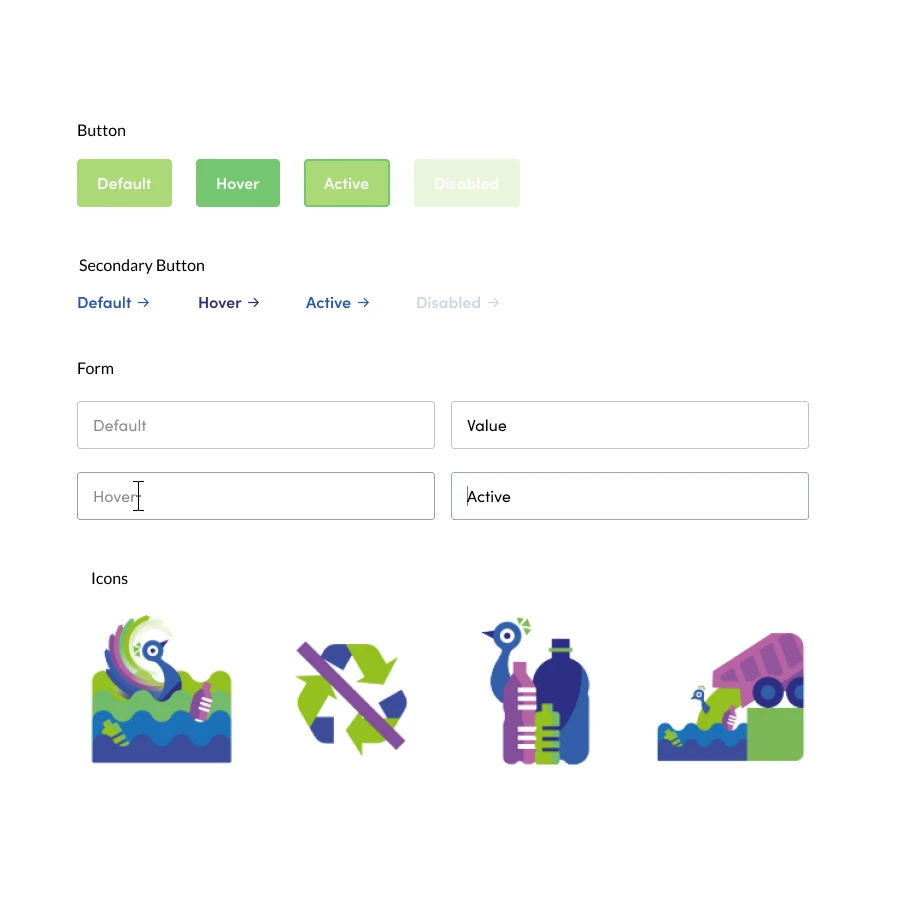
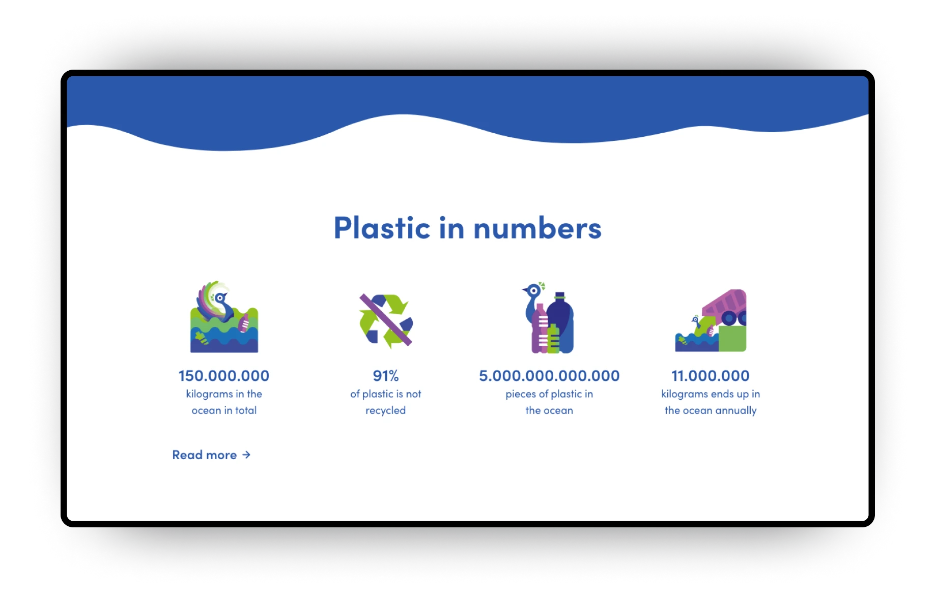
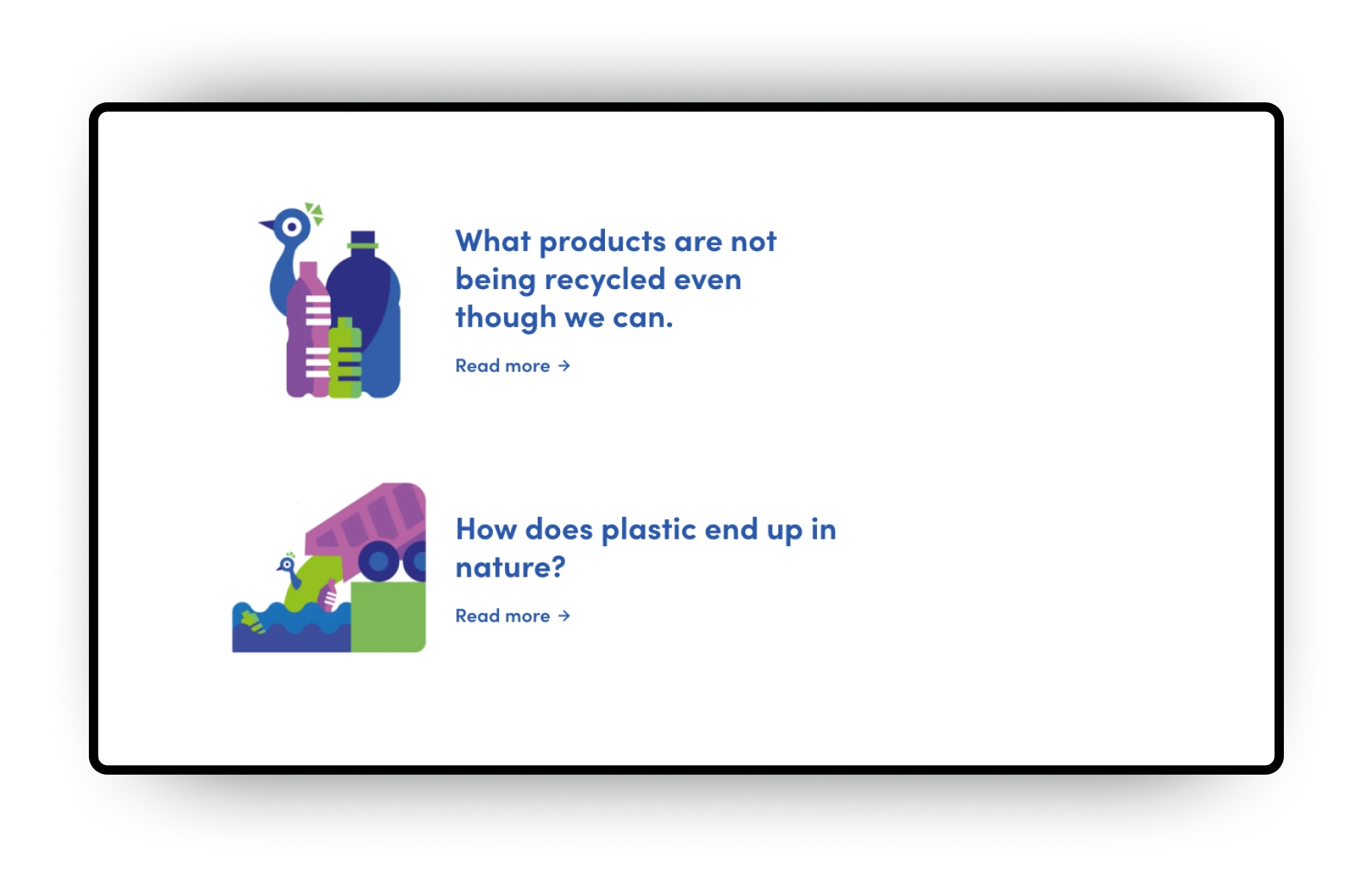
I created custom icons using the imagery of the peacock to create a recognizable branding.